

Your website has less than a tenth of a second to make the right impression. That is not a metaphor. Research confirms that users judge site credibility in 0.1 seconds, and visuals drive most of that judgment. For nonprofits, the stakes are especially high. A blurry photo or misplaced image does not just look unprofessional. It quietly signals to potential donors that your organization may not be trustworthy enough to support. Understanding the role of images in nonprofit website design is not optional for organizations that want to grow. It is fundamental to how you build credibility, tell your story, and convert visitors into long-term supporters.
Table of Contents
- Key takeaways
- Why image quality builds or breaks nonprofit credibility
- Strategic image placement for better storytelling
- Photography, illustrations, and icons: knowing what to use
- Technical image optimization for performance and SEO
- Putting it all together: images that convert visitors to donors
- My take: images are not an afterthought
- Ready to make your visuals work harder?
- FAQ
Key takeaways
| Point | Details |
|---|---|
| Images shape first impressions instantly | Visitors assess your site’s credibility in 0.1 seconds, making visual quality a top priority. |
| Image quality directly affects donor trust | Blurry or outdated photos signal disorganization and reduce a donor’s confidence in your mission. |
| Strategic placement guides user behavior | Where you position images influences emotional engagement, navigation, and donation conversions. |
| Different image types serve different roles | Photography, illustrations, and icons each perform a distinct psychological and functional purpose. |
| Optimization protects performance and SEO | Uncompressed images can slow your site and hurt search rankings, limiting your outreach reach. |
Why image quality builds or breaks nonprofit credibility
Every photo you publish is a statement about how seriously you take your organization. Donors read that statement before they read a single word of your mission. Poor image quality signals doubt to visitors about your professionalism and, by extension, your financial responsibility. That is a connection most nonprofit leaders do not expect, but it is one that web designers see constantly.

High-quality, original photography does something stock images cannot. It shows real people, real places, and real outcomes connected to your work. A photo of a volunteer actually serving a meal at your food bank carries far more emotional weight than a polished image purchased from a library. Strong visuals help information feel organized and current, which is exactly the impression you need to give donors before they click the “Donate” button.
Consistency matters just as much as quality. When your homepage uses warm-toned documentary photography but your about page features cold, corporate headshots, the visual mismatch creates subconscious friction. Visitors sense something is off, even if they cannot articulate why. Establishing a consistent image style across lighting, cropping, and color treatment signals that your organization is coordinated and competent. This is one of the less obvious but highly effective best practices for nonprofit visuals.
“Visual quality is inseparably linked to brand trust. Poor image use immediately signals doubt to donors about management capability.” This applies with full force to the nonprofit sector, where donors are making decisions about where to place their philanthropic trust.
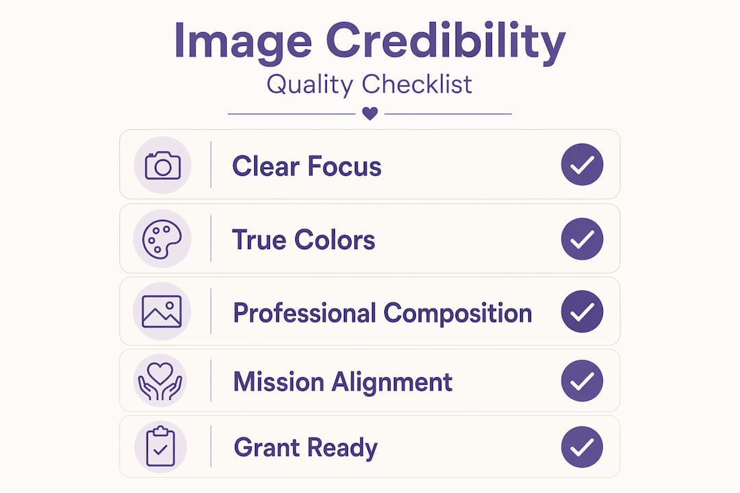
Pro Tip: Before publishing any image, ask whether it would look credible printed in a grant report. If not, it should not be on your website either.
Strategic image placement for better storytelling
Images are structural tools. They are not decorations you drop in after the text is written. Thoughtful placement shapes perception and guides users through your site the way signage guides visitors through a building. When you ignore placement, users lose the thread of your story. When you get it right, they feel pulled forward naturally toward taking action.
Here is a sequence that works well for nonprofit storytelling pages and donation flows:
- Open with a full-width human image above the headline. A single, emotionally resonant photo at the top of a page sets the tone before the visitor reads anything. It tells them who this is for and why it matters within the first glance.
- Pair images with supporting text in alternating layout blocks. Left-image with right-text, then right-image with left-text creates visual rhythm that keeps readers moving down the page without fatigue.
- Use smaller contextual images between major sections. These act as visual punctuation. They break up dense content and give the eye a moment to rest while reinforcing the message of the surrounding text.
- Place an image directly above or beside a call to action. A photo of a beneficiary next to a “Donate Today” button creates emotional context at exactly the moment you are asking for commitment.
- Use whitespace intentionally around key images. Crowding images with text or other visuals reduces their perceived quality. Breathing room signals confidence and professionalism.
Avoid the common mistake of placing images randomly wherever there is visual “space.” Every image placement should serve the narrative. If an image does not support the message of the content around it, it is creating noise rather than clarity. For a deeper look at how layout decisions affect nonprofit digital outreach, the relationship between image positioning and engagement is well worth studying.
Photography, illustrations, and icons: knowing what to use
Not all images perform the same function. Choosing the right type for each context is one of the most practical decisions in nonprofit website imagery.
| Image type | Primary function | Best use cases |
|---|---|---|
| Photography | Emotional authenticity | Mission pages, impact stories, team sections |
| Illustrations | Brand personality, creativity | Infographics, explainer sections, campaign pages |
| Icons | Navigation clarity, cognitive ease | Service lists, navigation menus, calls to action |
Photography is your most powerful tool for building emotional connection. Real photos of real people doing real work create the authenticity that visual storytelling for nonprofits depends on. Overused stock photos undermine this effect immediately. Visitors recognize generic stock imagery, and it signals inauthenticity faster than almost anything else.
Illustrations offer flexibility that photography cannot. If your nonprofit works across multiple regions or serves populations who cannot be photographed, custom illustrations can convey your mission with warmth and creativity. They also reinforce brand identity when designed with your organization’s color palette and visual language.
Icons are the quiet workhorses of effective nonprofit website design. They reduce cognitive load by letting users understand a function or category without having to read. A small icon of a hand holding a heart next to “Volunteer” communicates instantly. But icon misuse is common.
- Use icons consistently throughout the site, not just on one page
- Match line weight and corner radius across all icons for a cohesive look
- Size icons to be touch-friendly on mobile (minimum 44×44 pixels)
- Include ARIA labels on all icons used as functional elements for accessibility
Consistent iconography signals professionalism and reduces cognitive dissonance. Inconsistency, even in something as small as icon style, quietly erodes visitor trust.
Pro Tip: Choose one icon set and use it exclusively. Mixing two or three different icon styles on the same site is one of the most common ways nonprofit websites accidentally look amateurish.
Technical image optimization for performance and SEO
Great images that take five seconds to load are actively harming your mission. Failing to optimize can increase page weight by 60%, which directly slows your site and depresses your search rankings. For nonprofits trying to reach new donors through organic search, that is a serious cost.
Here are the technical priorities every nonprofit website should address:
- Use WebP format instead of JPEG or PNG wherever possible. WebP files are significantly smaller with comparable visual quality.
- Compress all images before uploading. Tools like Squoosh or your CMS’s built-in optimizer can reduce file sizes without visible quality loss.
- Write descriptive ALT text for every image. This serves both accessibility and SEO, helping search engines understand your content.
- Name image files descriptively. “volunteer-food-drive-chicago.webp” performs better in search than “IMG_4823.jpg.”
- Use SVG for icons and logos. SVGs scale without quality loss and carry almost no file weight.
Pro Tip: Treating images as content rather than decoration allows nonprofits to capture search traffic through image SEO, expanding outreach without additional advertising spend.
One underused tactic worth highlighting: geo-tagged project photos added to service or program pages can produce double-digit increases in click-through rates from local search. If your nonprofit operates in specific communities, this is a low-effort, high-return optimization worth implementing today. Pair this with your broader SEO strategy for nonprofits and the compounding effect on organic visibility becomes meaningful.
Putting it all together: images that convert visitors to donors
Knowing the principles is one thing. Applying them to your specific site is another. These steps bring together everything covered above into a practical framework for selecting and maintaining imagery that drives results.
- Audit your current image library. Remove any photo that is blurry, outdated, or could have come from a generic stock site. Replace with authentic imagery from your own programs and events wherever possible.
- Establish a visual style guide. Define your preferred color treatment, cropping style, and image subjects. Share this with anyone who uploads images to your site.
- Map images to your donation funnel. Identify which pages receive the most traffic before a donation is made, and prioritize high-quality imagery on those specific pages first.
- Test image placement near your calls to action. Move a strong human-interest photo closer to your “Donate” or “Volunteer” button and monitor whether engagement improves.
- Set a quarterly image review. Outdated images of old staff, past campaigns, or resolved crises can silently undermine your credibility. A regular audit keeps your site current and trustworthy.
Following these steps builds a site where images are doing active work, not just filling space. For organizations looking to go deeper on overall site strategy, reviewing nonprofit website design best practices alongside this framework gives you a more complete picture of what high-performing nonprofit sites share.
My take: images are not an afterthought
I have worked with nonprofit websites long enough to notice a pattern that repeats itself. Organizations invest deeply in their mission, their programs, their people. Then they treat their website images as something to handle last, often with whatever photos were handy or inexpensive.
In my experience, that sequencing costs them. A site with a powerful mission and weak visuals will consistently underperform a site with a slightly less powerful mission and outstanding imagery. That is uncomfortable to say, but donors make emotional decisions first and rational ones second. They are not reading your annual report before clicking donate. They are reacting to what they see.
What I’ve learned is that image consistency is often more impactful than image perfection. You do not need a professional photographer on retainer. You need a clear visual standard, applied consistently. A set of well-composed smartphone photos from your programs, cropped consistently, lit naturally, and placed thoughtfully, will outperform expensive stock photos every time.
The other truth I keep coming back to is that image optimization is where good intentions fall apart. Nonprofits do the hard creative work of choosing meaningful photos, then leave them uncompressed, unlabeled, and unstructured. The result is a site that looks right but performs poorly. Technical care for your images is not separate from your visual storytelling. It is what makes the storytelling actually reach people.
— Matt
Ready to make your visuals work harder?
If you recognize your site in any part of this article, you are not alone. Most nonprofit websites we encounter at Nonprofit-webdesign have strong missions and underserving imagery. The gap between the two is exactly where we do our best work.
Our nonprofit website redesign services include a full review of your current image strategy, from quality and placement to optimization and accessibility. We build image frameworks into your site architecture from the start, so your visuals are always supporting your mission rather than undermining it. For organizations that need ongoing support, our care and maintenance plans keep your site current, fast, and visually consistent over time. If you are ready to build a site where every image earns its place, we would be glad to help you get there.
FAQ
How do images affect donor trust on nonprofit websites?
Image quality directly influences how organized and credible a nonprofit appears. Blurry or outdated photos create immediate doubt about professionalism, while high-quality, authentic imagery builds confidence before a donor reads a single word.
What types of images work best for nonprofit websites?
Authentic photography from your actual programs builds the strongest emotional connection. Icons support navigation clarity, and illustrations work well for explaining complex programs. Using all three consistently creates a cohesive, trustworthy site experience.
How should nonprofits optimize images for SEO?
Use WebP format, compress files before uploading, write descriptive ALT text, and name image files with relevant keywords. Geo-tagged project photos on service pages can also produce meaningful increases in local search visibility.
Where should images be placed to increase donations?
Position emotionally resonant images directly above or beside your calls to action. Opening pages with a full-width human photo and using images to create visual rhythm throughout a donation flow both improve conversion rates meaningfully.
How often should nonprofit websites update their images?
A quarterly image audit is a practical minimum. Outdated staff photos, old campaign imagery, or visuals from resolved programs quietly signal stagnation and reduce the trust that new visitors need before they commit to donating.