

Many California nonprofits pour time and money into building a polished website, then wonder why their fundraising campaigns underperform. The answer often comes down to a simple but critical distinction: your homepage and your landing page are not the same thing, and treating them as interchangeable costs you donors. A focused, single-purpose landing page consistently outperforms a general homepage for campaign-specific goals, and understanding why can change how you approach every fundraising push, awareness drive, and volunteer recruitment effort your organization runs.
Table of Contents
- What is a landing page for nonprofits?
- The anatomy of a high-converting nonprofit landing page
- Measuring landing page performance: What counts?
- Tailoring landing pages for different nonprofit campaigns
- Why typical nonprofit landing page advice misses the mark
- Next steps: Amplify your nonprofit’s impact online
- Frequently asked questions
Key Takeaways
| Point | Details |
|---|---|
| Single-purpose design | Landing pages focus on one campaign goal—like donations or sign-ups—to maximize supporter action. |
| Best practices matter | Using concise headlines, clear calls-to-action, and minimal form fields drives conversion rates higher. |
| Measure with conversion rates | Tracking conversion rate reveals how effective your landing page is at turning visitors into donors. |
| Adapt to campaign needs | Urgent and planned campaigns require different landing page lengths and structures—test to find what works. |
| Analytics unlock improvements | Analyzing specific key actions helps optimize landing pages and highlights where to boost performance. |
What is a landing page for nonprofits?
With the intent defined, let’s unpack what sets a landing page apart from every other page on your nonprofit website.
Most people think of a website as a collection of pages that all serve the same general purpose: telling your story and inviting people to get involved. Your homepage does exactly that. It introduces your mission, links to your programs, shares your impact, and points visitors in multiple directions. That breadth is intentional. But breadth is the enemy of conversion.
A landing page is a single-purpose web page built for one campaign goal, such as donating, registering, volunteering, or signing up, rather than serving as a general homepage with navigation and many competing calls to action. Every design decision, every line of copy, and every button on that page exists to move the visitor toward that one action.
Single-purpose landing pages reduce what marketers call “decision fatigue.” When a visitor lands on your homepage and sees six navigation links, three program descriptions, a news feed, and a donate button buried in the footer, their attention scatters. When they land on a page with one clear message and one clear button, they decide faster and convert at higher rates.

Here is a side-by-side comparison to make the difference concrete:
| Feature | Homepage | Landing page |
|---|---|---|
| Primary goal | Inform and orient visitors | Drive one specific action |
| Navigation menu | Full site navigation | Removed or minimal |
| Number of CTAs | Multiple (donate, volunteer, learn more) | One focused CTA |
| Content length | Varies, often long | Tailored to campaign |
| Audience | General visitors | Targeted campaign audience |
| Measurement | Traffic, time on site | Conversion rate |
Key advantages of using a dedicated landing page for each campaign:
- Removes navigation links that pull visitors away from the goal
- Focuses the message on one audience segment and one need
- Makes it easier to track campaign-specific results
- Allows you to test and optimize without affecting your main site
- Aligns the page design with the campaign’s visual identity and urgency
The anatomy of a high-converting nonprofit landing page
Now that we know why landing pages work, let’s see exactly what makes one effective for fundraising and supporter engagement.
Fundraising-focused nonprofit landing pages use purpose-driven headlines, concise donor-centric copy, a singular prominent CTA button, and minimalist donation forms with only essential fields. Each of these elements plays a specific role, and skipping any one of them weakens the whole page.
Here is a practical breakdown of what every high-converting nonprofit landing page needs:
-
A purpose-driven headline. Your headline should answer one question in under ten words: “Why should I give right now?” Avoid vague phrases like “Make a Difference.” Instead, try something specific: “Help feed 500 San Diego families this winter.” Specificity builds credibility and urgency at the same time.
-
Donor-centric persuasive copy. Write from the donor’s perspective, not your organization’s. Instead of “We serve 2,000 children annually,” try “Your gift today gives a child access to tutoring, meals, and a safe space to grow.” The donor is the hero of the story. Your organization is the vehicle that makes their impact possible.
-
A singular, prominent CTA button. One button. One color that contrasts with the rest of the page. One action word: “Donate Now,” “Join Us,” or “Save a Seat.” Placing two or three CTA buttons with different labels forces the visitor to make a choice they did not come to make. Keep it simple.
-
A minimalist donation form. The donation funnel optimization principle is straightforward: every additional field you add to a form reduces the number of people who complete it. Collect only what you need: donation amount, name, email address, and payment information. Save the survey questions for the thank-you page.
-
Social proof and trust signals. A short testimonial from a beneficiary or a previous donor, a logo from a credible partner organization, or a simple statement like “Join 3,400 supporters” builds confidence. First-time donors especially need reassurance that their gift will be used responsibly.
-
A compelling image or short video. Visuals communicate emotion faster than text. A single, high-quality photo of the people your organization serves can do more work than three paragraphs of copy. If you use video, keep it under 90 seconds and make sure it loads quickly on mobile devices.
Pro Tip: Remove your site’s main navigation menu from your landing page. Every link you leave in place is an exit ramp. Visitors who click away to read your “About” page rarely come back to donate. For guidance on structuring donation forms and page layouts, look at examples from organizations in your sector before building your own.
Measuring landing page performance: What counts?
Building a great landing page is just the start. Next, you’ll need to track its success using conversion rates.
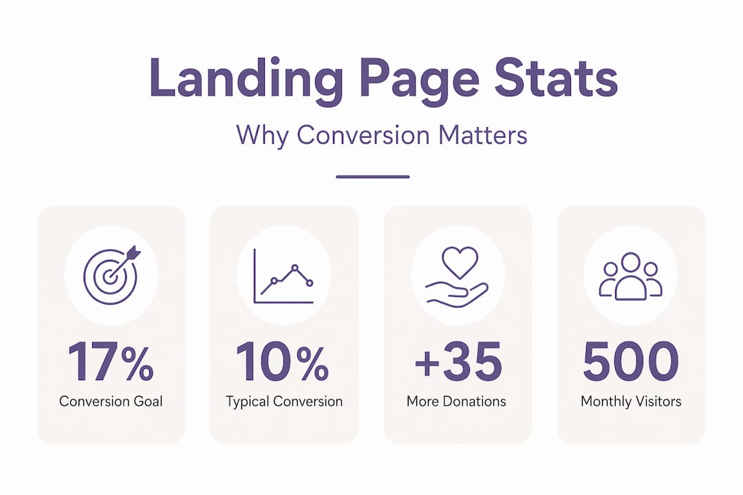
Nonprofit landing pages can be measured using conversion rate, which is the percentage of visitors who complete a desired action. Calculating it is straightforward: divide the number of completed actions (donations, sign-ups) by the total number of page visitors, then multiply by 100. If 200 people visit your donation landing page and 34 donate, your conversion rate is 17%.
“The nonprofit industry average conversion rate on donation pages is about 17%.” — Virtuous
That 17% benchmark gives you a meaningful target. If your pages are converting at 8% or 9%, you have clear room to improve. If you are already at 20%, you are outperforming most organizations and can focus on increasing traffic volume rather than page design.
Here is a reference table showing how conversion rates translate into real donation volume:
| Monthly visitors | Conversion rate | Donations received |
|---|---|---|
| 500 | 10% | 50 |
| 500 | 17% | 85 |
| 500 | 22% | 110 |
| 1,000 | 17% | 170 |
| 1,000 | 22% | 220 |
The math makes the case clearly. Improving your conversion rate from 10% to 17% on 500 monthly visitors adds 35 donations without spending a dollar on additional advertising or outreach. That is the power of optimizing what you already have.
Conversion rate is not the only metric that matters, but it is the most direct signal of whether your landing page is doing its job. Pair it with average donation amount to calculate total revenue per campaign, and you have a complete picture of performance.
Tailoring landing pages for different nonprofit campaigns
Different campaigns require unique landing page approaches. Here is how to adapt and optimize for your goals.
Not every campaign has the same emotional temperature or timeline. A disaster relief appeal after a California wildfire demands an entirely different page structure than a capital campaign to build a new community center. Nonprofit landing pages are often campaign-specific; urgent appeals may work better with shorter pages, longer campaigns may require more detail, and testing both approaches is recommended.
Here is how to think about page length and structure by campaign type:
-
Urgent appeals (disaster relief, matching gift deadlines). Keep these pages short and emotionally direct. Lead with the crisis, state the impact of a gift immediately, and place the donation form above the fold. Urgency is the primary motivator, so do not bury it under paragraphs of background information.
-
Capital campaigns and major gift solicitation. These campaigns ask donors to make larger, more considered decisions. Longer pages with detailed impact breakdowns, donor recognition tiers, project timelines, and leadership endorsements give major donors the information they need to commit confidently.
-
Volunteer recruitment. Focus on the experience and the community, not just the task. Include photos of volunteers in action, a simple sign-up form, and a clear description of what the commitment involves. Reduce uncertainty and the sign-up rate climbs.
-
Awareness campaigns tied to California-specific issues. Whether you are addressing housing insecurity in Los Angeles or water access in the Central Valley, localize your copy and imagery. Donors respond more strongly to campaigns that reflect their own community.
Tailoring pages to campaign goals also means thinking about traffic sources. A donor who clicks through from your email newsletter already knows your organization. A visitor arriving from a paid social ad may be encountering you for the first time. The page needs to meet each audience where they are.
Pro Tip: Run A/B tests on page length, headline copy, and CTA button text before committing to a final design. Test one variable at a time so you know exactly what drove the change. Even small improvements in conversion rate compound significantly over a full campaign cycle. Pairing this with SEO strategies for nonprofits ensures that your optimized pages also attract organic traffic from supporters actively searching for causes like yours.
Expert nuance: Decoding analytics for nonprofit landing pages
Beyond conversion rates, understanding analytics is crucial. Here is how to get actionable insights from your landing pages.
One of the most common mistakes California nonprofits make is reviewing site-wide traffic data and drawing conclusions about individual campaign pages. Donation page conversion is not the same thing as site-wide engagement. Analytics should track the specific key actions, such as donations and sign-ups, so you can diagnose whether the problem is acquisition and traffic quality versus friction in the donation or CTA flow.
In practical terms, this means setting up goal tracking in your analytics platform for each landing page separately. Here is a numbered list of the metrics every nonprofit should monitor at the landing page level:
- Page-specific conversion rate. Tracked separately from your homepage and other site pages.
- Traffic source breakdown. Which channels (email, social, paid ads, organic search) send the most converting visitors?
- Bounce rate on the landing page. A high bounce rate often signals a mismatch between the ad or email that drove the click and the page content.
- Form abandonment rate. How many visitors start filling out your donation form but do not complete it? This points directly to form friction.
- Average time on page. Very short times may indicate the page is not engaging visitors long enough to convert.
- Device breakdown. If most of your traffic is mobile but your form is not mobile-optimized, you are losing donors at the final step.
Connecting your landing page analytics to donor management analytics gives you a fuller picture. You can track not just who donated, but whether they became recurring donors, how much they gave over time, and which campaigns attracted your highest-value supporters.
Why typical nonprofit landing page advice misses the mark
Having laid out the evidence, let’s step back and examine what most nonprofits get wrong and what actually works in California.
Most landing page guides hand you a checklist: add a headline, include a photo, reduce form fields, test your CTA. That advice is not wrong. But it treats every nonprofit as if they are interchangeable, and they are not. A food bank in Fresno serving agricultural workers is speaking to a fundamentally different donor base than an arts organization in San Francisco raising funds for youth programs.
Generic checklists ignore the motivation behind the gift. California donors are not a monolith. Some give because of deep community ties. Others respond to environmental urgency, social justice framing, or personal connection to a cause. When you apply a templated landing page to a nuanced audience, you get average results at best.
What we have seen work consistently over years of supporting nonprofits is this: mission-driven stories outperform polished templates every time. A real photo of a real person your organization helped, paired with a specific and honest description of what a $50 gift does, will outperform a stock image and generic copy on almost every campaign. Authenticity is not just a brand value. It is a conversion strategy.
California nonprofits also tend to underestimate the role of mobile experience. With a large and diverse population that skews toward mobile browsing, a landing page that is not fully optimized for a phone screen is leaving significant donor revenue on the table. This is not a technical afterthought. It is a core design requirement.
Our perspective, shaped by working with nonprofits since 2005, is that the best landing pages are built around a specific supporter’s journey, not a general best practice framework. Start with your audience, understand what motivates them, and then apply the structural best practices. Not the other way around. Explore more on our nonprofit web tactics blog for campaign-specific guidance rooted in real organizational experience.
Next steps: Amplify your nonprofit’s impact online
Ready to start applying these strategies? Here is where to get expert help for your nonprofit landing pages.
Building landing pages that convert takes more than good intentions. It takes the right structure, the right design, and a clear understanding of your campaign goals. Since 2005, we have helped California nonprofits build professional, purpose-driven websites that make fundraising easier and supporter engagement stronger.
Whether you need a full website redesign for nonprofits, a new nonprofit website design built from the ground up, or targeted donation funnel optimization to improve your existing pages, we offer affordable solutions designed specifically for organizations like yours. You focus on your mission. We will build the online presence that supports it.
Frequently asked questions
What is the main purpose of a nonprofit landing page?
A nonprofit landing page is designed to drive a specific action, such as a donation or sign-up, by focusing visitors’ attention on one campaign goal rather than offering multiple paths through the site.
How do I know if my nonprofit landing page is successful?
Success is measured primarily by conversion rate, which tracks the percentage of visitors completing key actions like donations or sign-ups, benchmarked against the nonprofit industry average of around 17%.
Should landing pages be different for urgent and planned campaigns?
Yes. Urgent campaigns benefit from shorter, emotionally direct pages, while planned campaigns like capital drives often need longer layouts with detailed impact information and donor recognition tiers.
What fields should be included in a nonprofit donation form?
Donation forms should request only essential information: amount, name, email, and payment details. Adding extra fields reduces form completion rates and lowers your overall conversion rate.
How can analytics improve fundraising landing pages?
Analytics help you diagnose whether low conversions stem from poor traffic quality or friction in the donation flow, letting you target improvements precisely rather than guessing at what needs to change.