

Color accounts for 62 to 90% of snap judgments people make about a brand the moment they land on a website. For nonprofit organizations, that fraction of a second is not just about aesthetics. It is about trust, urgency, and the emotional pull that moves a visitor from passive reader to active donor. The role of color psychology in nonprofit sites is often treated as a finishing touch rather than a foundational decision. This guide changes that, walking you through the science, the strategy, and the practical steps to put color to work for your mission.
Table of Contents
- Understanding the basics of color psychology for nonprofits
- Why consistent color use enhances trust and fundraising success
- Avoiding pitfalls: the memory color effect and brand-color fit
- Using color strategically to improve website engagement and calls to action
- Balancing mission clarity and emotional connection through color branding
- Why long-term color strategy beats short-term trends for nonprofits
- Leverage expert web design to maximize your nonprofit’s color impact
- Frequently asked questions
Key Takeaways
| Point | Details |
|---|---|
| Color drives perception | Up to 90% of brand judgments are based on color, making it crucial for nonprofit websites. |
| Consistency builds trust | Using a consistent color palette activates positive emotional centers in donors’ brains and increases giving. |
| Align color with mission | Choose colors that fit your nonprofit’s purpose to avoid disconnect and strengthen engagement. |
| Avoid trend-chasing | Long-term, mission-aligned color strategies outperform short-term fad colors in building recognition. |
| Test colors strategically | Use A/B testing on website elements to find hues that improve donor engagement and conversion rates. |
Understanding the basics of color psychology for nonprofits
Colors are not decorative. They are a form of communication that your audience processes before they read a single word on your page. The psychology of colors in marketing is well documented, and the core finding is consistent: colors reliably trigger emotions, and those emotions shape decisions.
For nonprofits, this matters because your website is doing more than displaying information. It is building a case for why someone should care, trust you, and give. Your nonprofit website design choices, including color, are doing persuasive work every second a visitor is on your page.
Here is how common colors map to emotional responses relevant to your mission:
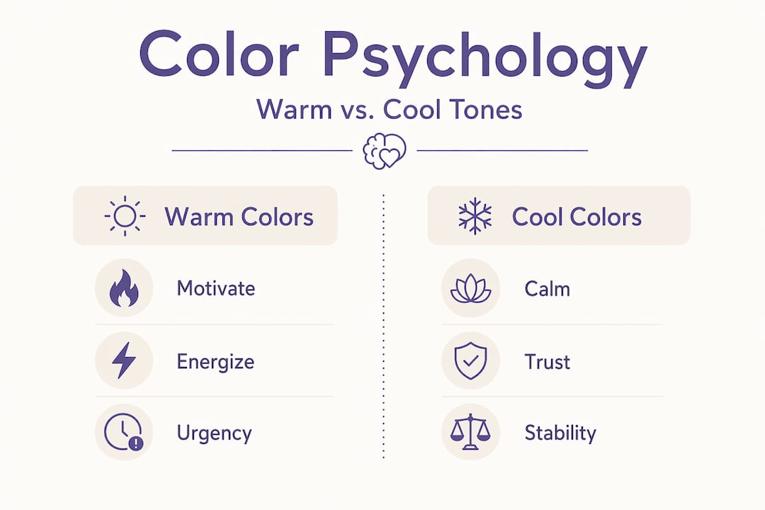
- Red signals urgency, passion, and action. It is widely used in disaster relief and health-related causes where immediate response matters.
- Orange creates energy and enthusiasm without the intensity of red. It works well for community-focused organizations and calls to action.
- Blue builds trust, reliability, and calm. It is the most used color in nonprofit branding for good reason. Donors associate it with stability.
- Green communicates growth, health, and environmental responsibility. Environmental and wellness organizations lean into it heavily.
- Yellow attracts attention and conveys optimism, though it can feel overwhelming in large doses.
- Purple signals dignity, wisdom, and compassion. It is used effectively by organizations focused on mental health and social justice.
Understanding color psychology in charities means recognizing that warm colors activate and motivate, while cool colors reassure and build confidence. The challenge is knowing which emotional state your donors need to be in when they take action on your site.
Why consistent color use enhances trust and fundraising success
Understanding color emotions is only half the equation. The other half is using those colors consistently across your entire online presence.
Research into donor behavior reveals something concrete and actionable. Consistent use of images and language activated donors’ nucleus accumbens, the brain’s reward center, creating a positive emotional experience that directly increased donation rates. In plain terms: when your colors, visuals, and messaging all feel emotionally aligned, donors feel good about giving. When they do not align, that positive signal breaks down.
“The impact of colors on nonprofits goes far beyond visual style. Consistent color use activates the emotional reward pathways in your donors’ brains, turning aesthetic choices into fundraising tools.”
Brand consistency across every touchpoint reinforces this effect. Your donation page, your social media headers, your email newsletters, and your homepage should all speak the same emotional language. A donor who feels at ease on your social feed and then lands on a donation page that looks visually disconnected will hesitate. That hesitation costs you.
For your donation funnel optimization, this means treating color not as a single-page decision but as a site-wide strategy.
Pro Tip: Create a simple color style guide for your nonprofit that specifies your primary, secondary, and accent colors along with their hex codes. Share it with everyone who creates content for your organization. This single document can dramatically improve emotional consistency across all your channels.
Avoiding pitfalls: the memory color effect and brand-color fit
Once you understand why consistency builds trust, the next step is understanding what happens when you break that consistency or choose the wrong colors in the first place.
The memory color effect describes how donors form subconscious associations between a brand and its colors over time. Changing established colors disrupts these neural pathways and can reduce engagement, even among supporters who have been with you for years. They may not be able to articulate why your new website feels “off,” but they will feel it. That friction erodes trust quietly.
This is not an argument against ever updating your visual identity. It is an argument for doing so deliberately and carefully, with your audience in mind.
The second major pitfall is choosing colors based on general meaning rather than mission fit. Brand-color fit matters more than any universal color chart. A children’s literacy nonprofit and a corporate disaster relief fund might both theoretically benefit from blue’s trust associations, but the shades, combinations, and contexts need to reflect entirely different identities.
When evaluating color choices, watch out for these common mistakes:
- Copying industry defaults without reflection. Blue is trustworthy, but if every nonprofit in your space uses it, you become invisible.
- Choosing colors that contradict your mission tone. A grief support organization using high-energy orange as its primary color sends a confusing signal.
- Ignoring accessibility. Low contrast between text and background colors excludes users with visual impairments and violates best practices for nonprofit websites.
- Letting budget drive color decisions. Printing in two colors is a cost consideration, but it should not force you into a color combination that undermines your brand.
Pro Tip: Before finalizing any color palette, show it to a small group of your actual donors or community members and ask one question: “What does this feel like?” Their answers will tell you more than any color theory chart.
Using color strategically to improve website engagement and calls to action
With psychology and pitfalls covered, here is where color becomes a direct conversion tool on your website.

Color psychology is foundational to visual hierarchy and conversion, and A/B testing is the most reliable way to find what actually works with your specific audience. General rules give you a starting point. Data gives you answers.
Follow these steps to apply color strategically on your nonprofit site:
- Identify your primary action. For most nonprofits, this is the “Donate Now” button. Every color decision on your page should support that action, not compete with it.
- Use contrast deliberately. Your call-to-action button needs to stand out visually from the surrounding page. If your background is navy blue, a white or orange button will outperform a lighter blue one.
- Limit your active palette. Using more than three to four colors on a single page creates visual noise and dilutes focus. Reserve accent colors for actions you want visitors to take.
- Test one variable at a time. Run A/B tests on button color before moving to header images or background colors. Isolating variables gives you clean data.
- Review your SEO strategies for nonprofits alongside color changes. A redesign that improves visual hierarchy can also improve time on page, which supports search rankings.
Here is a comparison of common color choices for nonprofit “Donate” buttons and their typical performance characteristics:
| Button color | Emotional association | Best used when |
|---|---|---|
| Orange | Urgency, enthusiasm | Campaigns with deadlines or matching gifts |
| Green | Positive action, growth | Environmental or wellness missions |
| Red | Passion, immediate need | Disaster relief, crisis fundraising |
| Blue (dark) | Trust, reliability | Institutional or long-standing organizations |
| Yellow | Optimism, attention | Youth-focused or community causes |
Pro Tip: Do not just test button color. Test the color of the text inside the button and the color of the surrounding whitespace. Small changes in contrast and visual breathing room often outperform major color swaps.
How color influences donations is not fixed. It responds to context, timing, and audience. Your data will tell you more than any general guide, including this one.
Balancing mission clarity and emotional connection through color branding
Color strategy does not live only on your website. It is part of your broader brand, and that brand is a statement about who you are, what you stand for, and who you serve.
Branding, including color strategy, should unite communities and reassure audiences rather than function as a simple aesthetic refresh. This is especially true during periods of social or political uncertainty, when your stakeholders need to feel that your organization is grounded and consistent.
Effective color branding for social causes serves several practical functions:
- It signals organizational stability to funders and grant-makers who evaluate your materials.
- It creates visual recognition across print, digital, and event materials, reducing the cognitive effort donors need to identify and trust you.
- It gives volunteers and staff a shared visual language that builds internal pride and cohesion.
- It communicates your values before a potential donor reads your mission statement.
Community input is also part of nonprofit branding best practices. The most authentic color choices come from understanding how your community perceives and responds to color, not from importing choices from unrelated industries.
Ask your community. Survey your donors. The answers to “what color feels like home to you” or “what color reminds you of hope” within your specific cultural context will ground your palette in real emotional truth.
Why long-term color strategy beats short-term trends for nonprofits
Here is the uncomfortable truth that most branding conversations avoid: trend-chasing is actively harmful for nonprofits.
Every few years, a new color palette dominates design culture. Right now, earthy neutrals and muted pastels are everywhere. Before that, it was bold, saturated gradients. Nonprofits with stable, mission-aligned color identities do not need to care. They have something more valuable than currency: recognition. Charities that treat color as a long-term asset build emotional resonance and recognition that no trend-driven refresh can manufacture.
For-profit companies can rebrand frequently because their audiences expect evolution. Your donors are different. They have an emotional relationship with your cause, and your visual identity is part of that relationship. When you change your colors to feel modern, you risk signaling change in a context where stability is a virtue.
We have worked with nonprofits since 2005, and the organizations with the strongest donor retention are almost always the ones with the most visually consistent identities. Not the most beautiful. Not the most on-trend. The most consistent.
There is also a practical budget reality. Following best practices for nonprofits means making every dollar count. Color choices that require frequent updates across your website, print materials, social media templates, and email campaigns are expensive. A color strategy built to last five to ten years is not just smarter branding. It is responsible stewardship of your resources.
Choose colors for who you are and who you serve. Then hold them.
Leverage expert web design to maximize your nonprofit’s color impact
Knowing the principles is a strong start. Applying them correctly across every page of your site, while accounting for accessibility standards, visual hierarchy, and donation funnel performance, requires expertise that most nonprofit teams simply do not have in-house.
Since 2005, we have specialized in purpose-driven web design built specifically for nonprofits. We understand that color choices for social causes carry real stakes: donor trust, community recognition, and mission impact. Our nonprofit website design services put color psychology to work alongside proven conversion strategies so your site does more than look good. If you are starting fresh or rethinking your current presence, our nonprofit website redesign services bring all of these principles together in a site built to grow with your organization. Explore our nonprofit website best practices to see how we approach every design decision with your mission in mind.
Frequently asked questions
How does color psychology affect donor behavior on nonprofit websites?
Color psychology influences donors by triggering emotional responses that shape trust and urgency, and color drives 62 to 90% of the snap judgments visitors make about your brand the moment they arrive.
Why is consistent color use important for nonprofit fundraising?
Consistent color use activates donors’ nucleus accumbens, the brain’s reward center, creating positive emotional experiences that increase willingness to donate across multiple visits and campaigns.
Can changing my nonprofit’s colors harm supporter engagement?
Yes. Changing brand colors disrupts the subconscious neural pathways supporters have built with your visual identity, creating cognitive friction that quietly reduces trust and engagement even among long-term donors.
Should nonprofits follow popular color trends in branding?
No. Nonprofits should prioritize a consistent, mission-aligned color strategy because charities that avoid trend-chasing build deeper emotional resonance and lasting recognition that trend-driven rebrands consistently fail to deliver.
How can nonprofits choose the best colors for their website?
Start by defining the emotional response you want donors to feel, then research color choices within your sector, test palette variations with real audience members, and align color with your mission and cultural context before finalizing any decisions.